Ruimtetijd
Brand Identity
Discover Fort Ruimtetijd near Haarlem – where history meets creativity. This iconic fort, part of UNESCO's heritage, is not just a relic – it's a dynamic hub of innovation.
Fort Ruimtetijd is a living piece of history linked to the renowned De Stelling van Amsterdam. This defense line, operational from 1880 to 1920, is now a UNESCO heritage site. Yet, this fort isn't just a historical relic; it's a lively center of creativity and innovation.
In this vibrant sanctuary, sustainability and boundless creativity shine bright. Makers, artists, visionaries, and students unite, breathing life into the cultural sector.
In this vibrant sanctuary, sustainability and boundless creativity shine bright. Makers, artists, visionaries, and students unite, breathing life into the cultural sector.

“Reality is nothing but a dot on the canvas of the present, past, and future.”
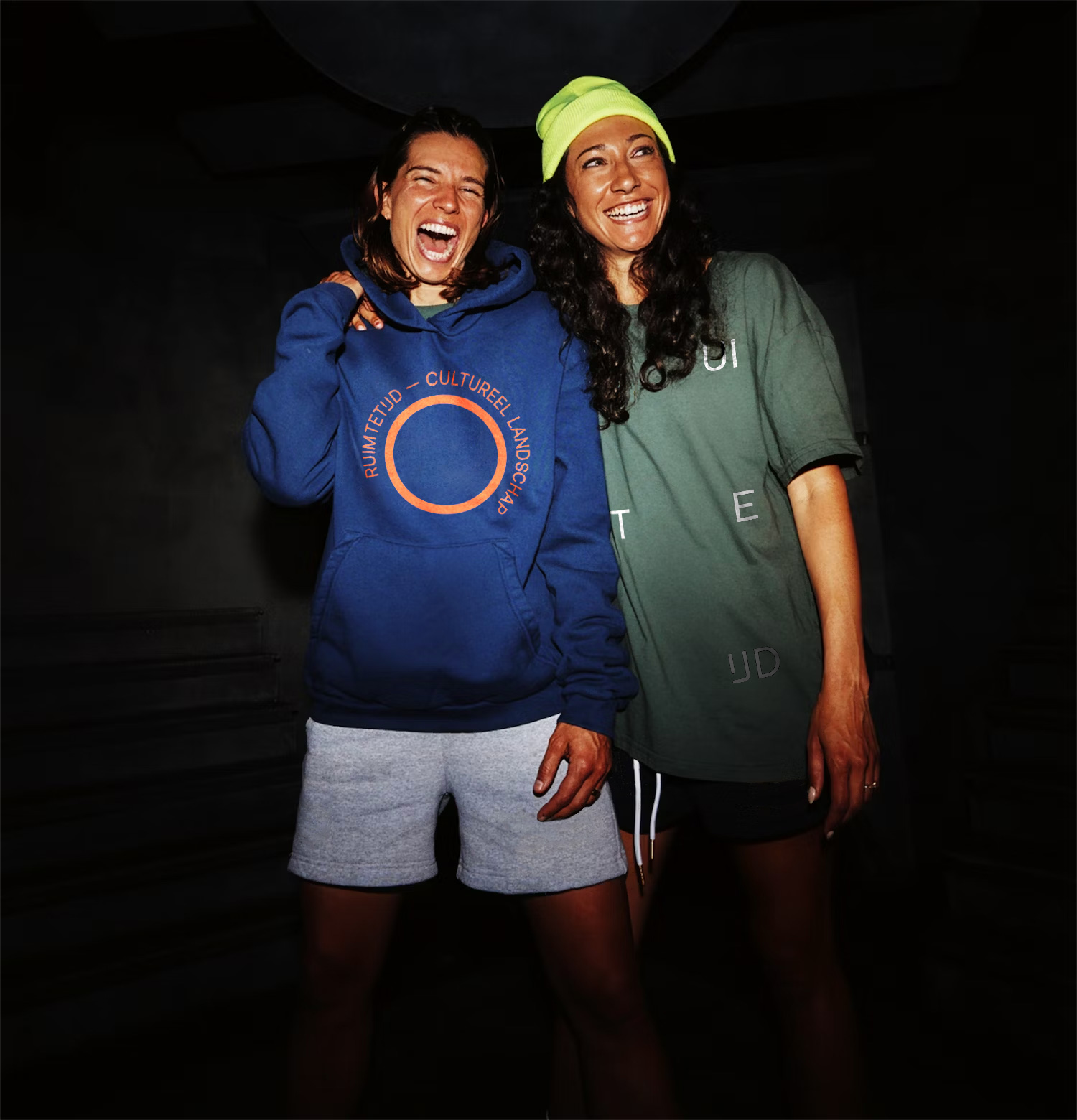

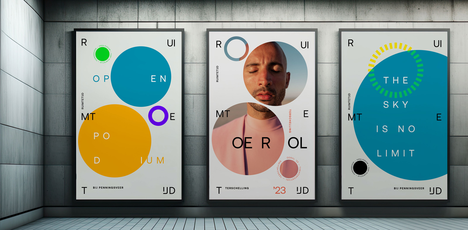
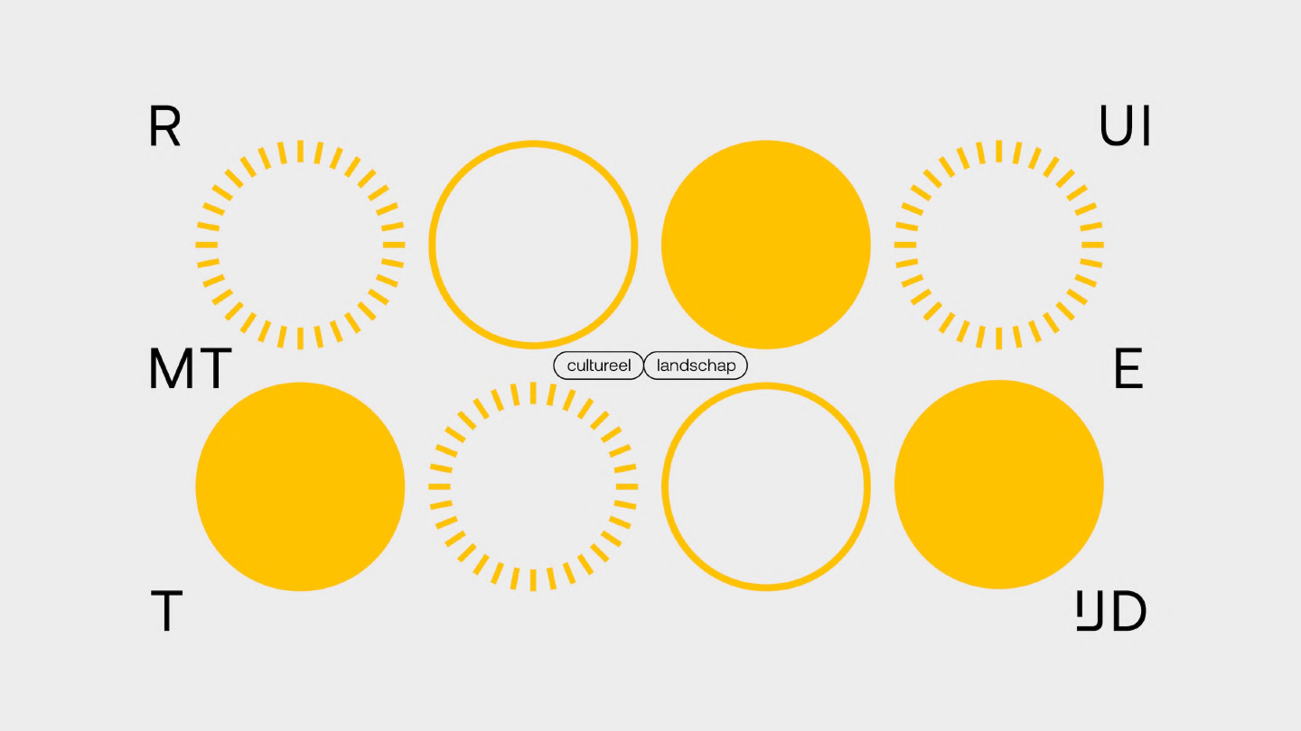
The visual identity of Ruimtetijd reflects the complex concept of a light cone in special and general relativity.
We infused Ruimtetijd with the vibe of "the omnipresence of time." Interconnected dots span past, present, and future – a playful palette inspired by space and time. Just like light beams through spacetime, Ruimtetijd's visual essence beams through past, present, and future, exploring the uncharted creative path.
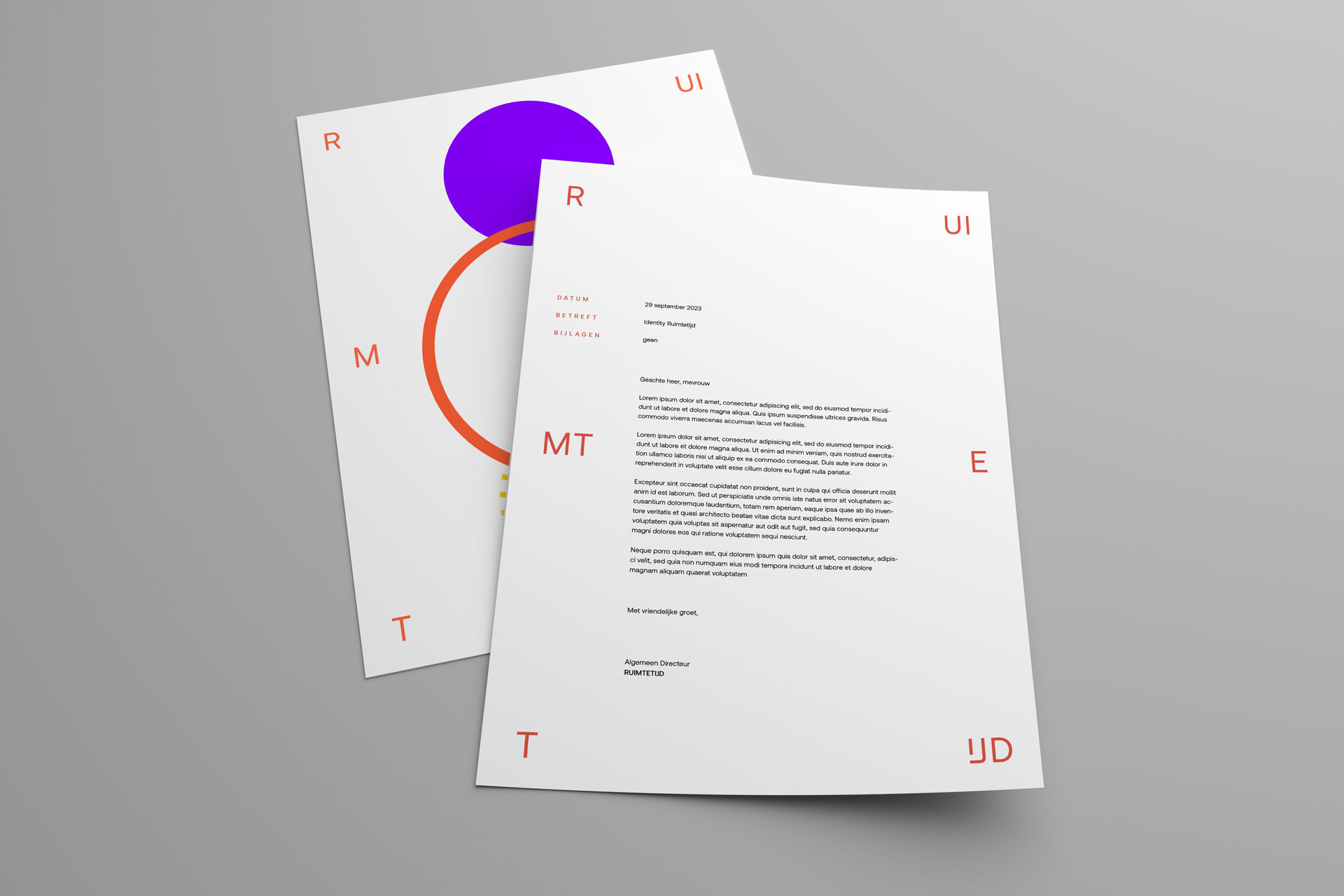
Typography dances freely, bold and unrestrained. Words break free, weaving into the canvas of creativity. It's not just aesthetics; it's a statement. Claiming space boldly mirrors our approach, embracing boundless creative thought and limitless artistic potential → exploring the unknown.