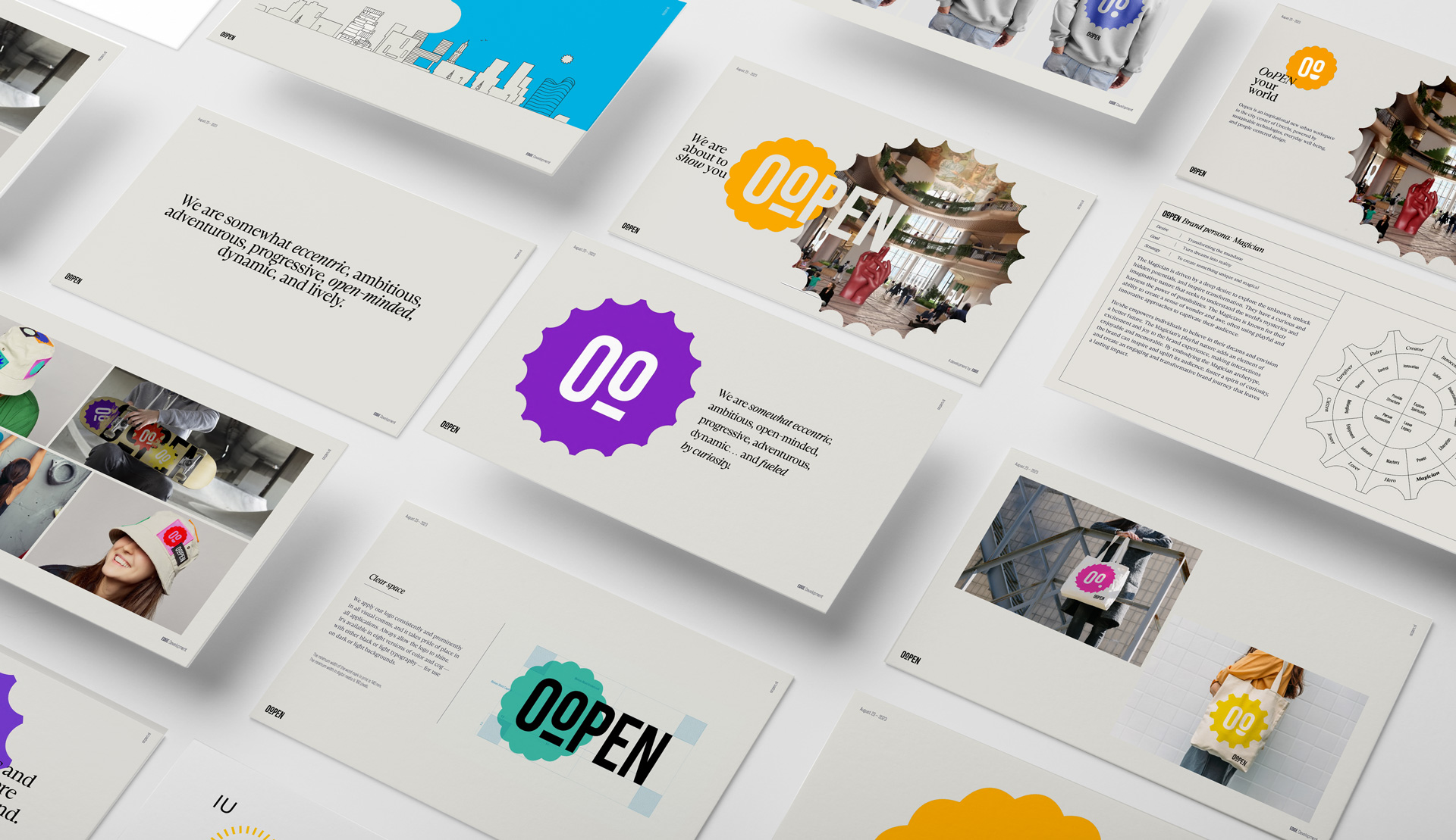
Oopen
Brand Identity
Behold the vibrant visual dance we've crafted for Oopen, a concoction brewed by the London-based maestro Heatherwick Studio. The building is a blend of culture, work, leisure, and community, all under one roof.
To capture Oopen's soul, we stirred modernity with a sprinkle of whimsy, mirroring the building's quirky architecture. Picture Oopen—a nightclub's pulsating rhythm, the hush of creative havens, the bustling offices, and that magnetic "Crown" atop, all spun into the many stacked cogs that inspired its design.
The stacked cogs are a nod to Jaarbeurs' industrial past and an ode to Oopen's adaptability. It's a puzzle, a cryptic code weaving Oopen's story into an enigmatic façade.
The colors we chose are alive! They mirror Jaarbeursplein's vivacity, bold and vibrant, just like Oopen's multifaceted spaces. The fonts blend clean modernity with a playful twist, like a melody that resonates with the building's heart.
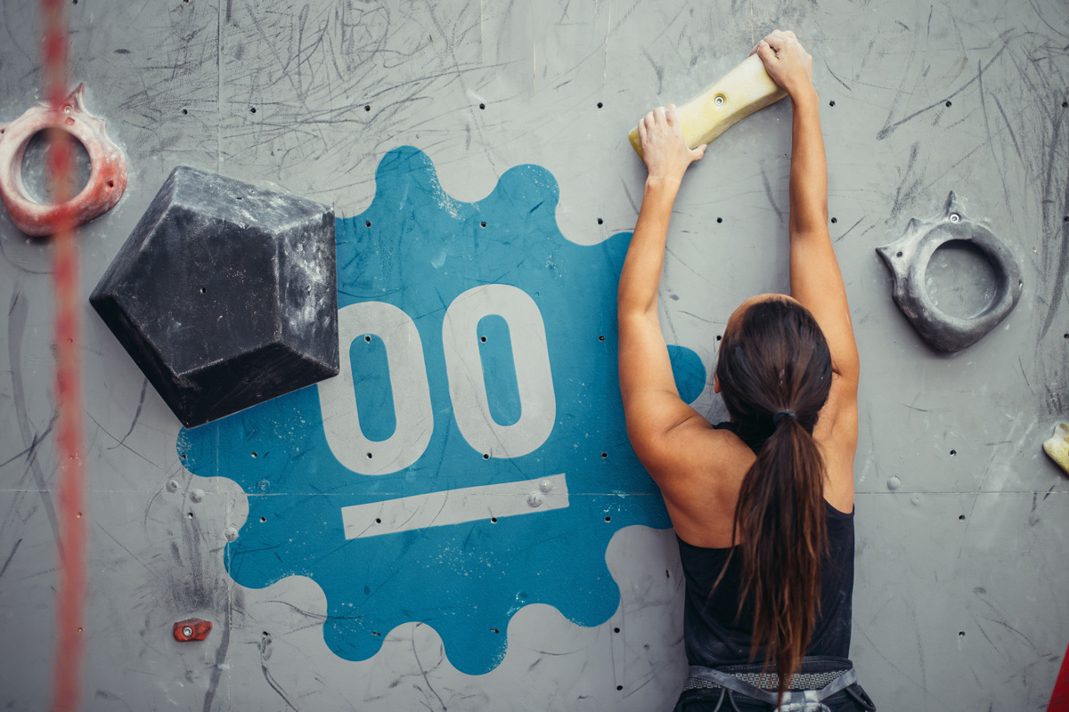
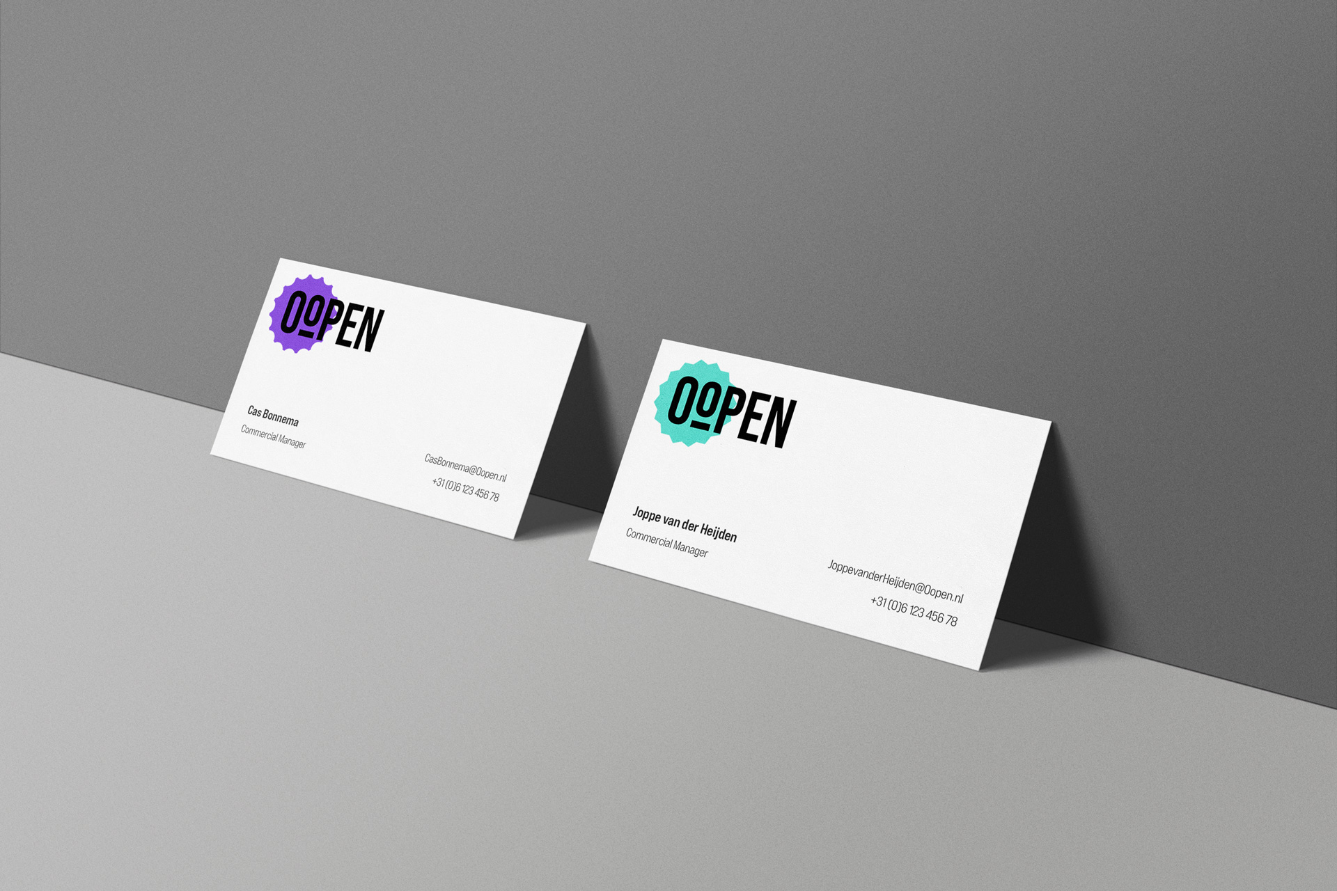


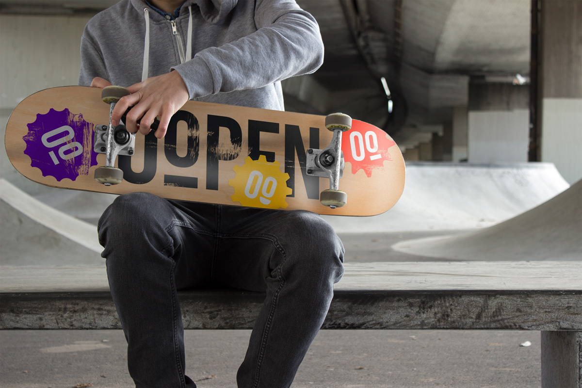
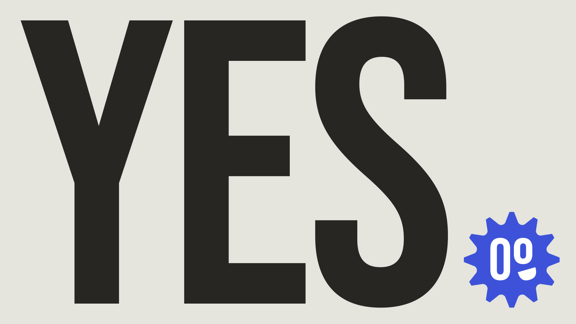

Oopen is alive and, thus, the identity is. The logo represents a set of bespoke emojis, each whispering a personal story—a beat for the nightclub, sanctuaries for culture, the crown jewel itself, and much more.
Each emoji is a thread in the tapestry of Oopen's narrative. This identity isn't just a face; it's an open doorway. It's a silent conversation, beckoning one to explore Oopen's depths, engage with the community, and rouse the curiosity of those wandering by. It's a nod to versatility, a celebration of inclusivity—an invitation to lose oneself in a space where the city's rhythm merges with infinite possibilities—a space known as Oopen.