Kaiko
Brand Identity
Services
Brand Strategy
Naming
Brand Design
Brand Guidelines
Brand Strategy
Naming
Brand Design
Brand Guidelines
Uncover what’s hidden
Introducing Kaiko - the visionary brand that is revolutionizing the world of cancer research. Kaiko mines deep data to uncover hidden correlations and empower hospitals and research institutes with valuable insights and the latest advancements in machine-learning research.
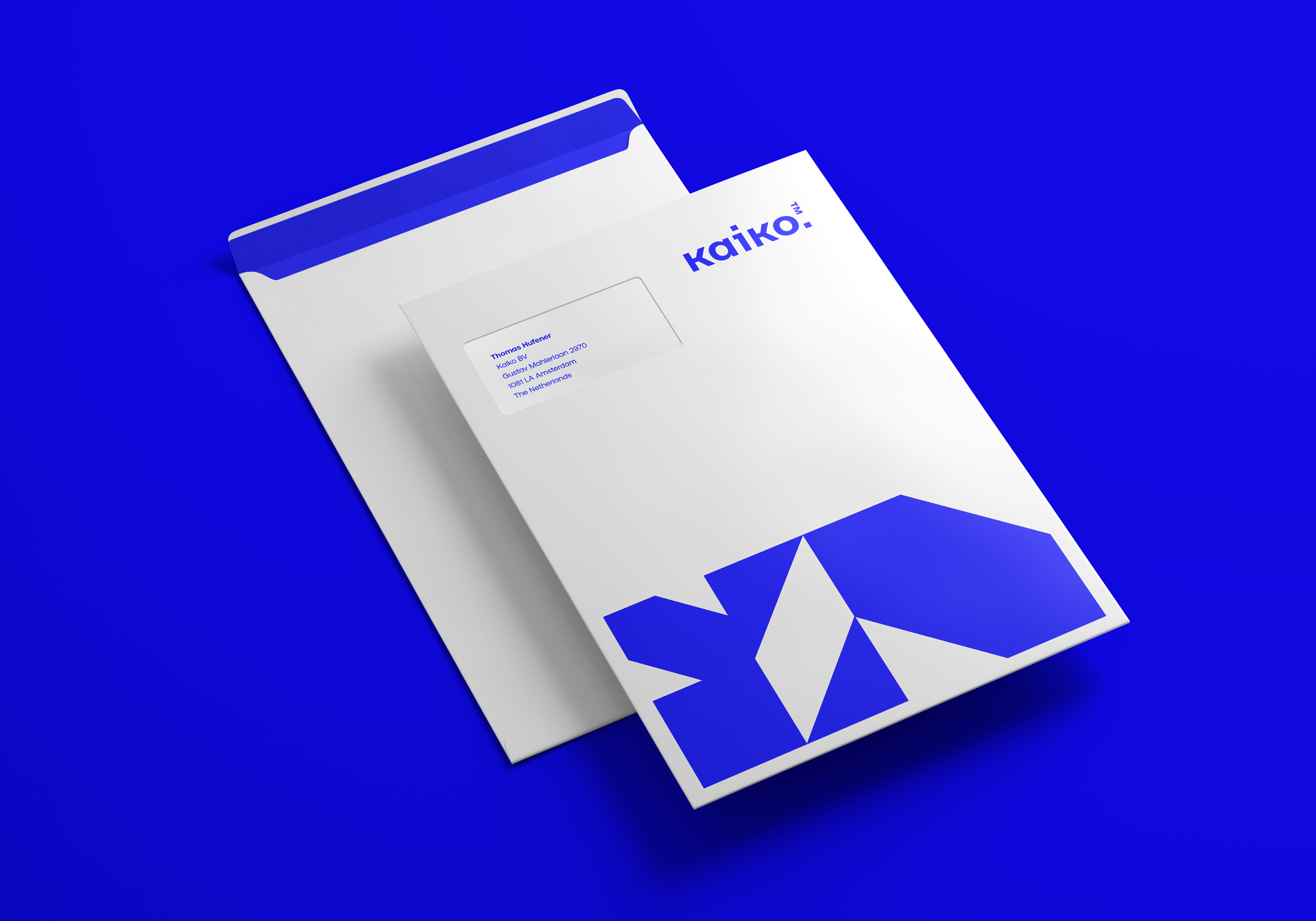
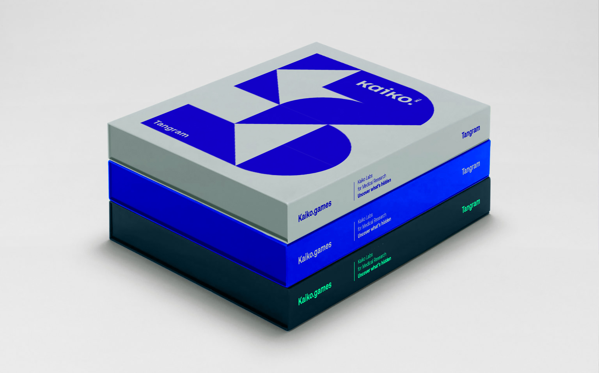
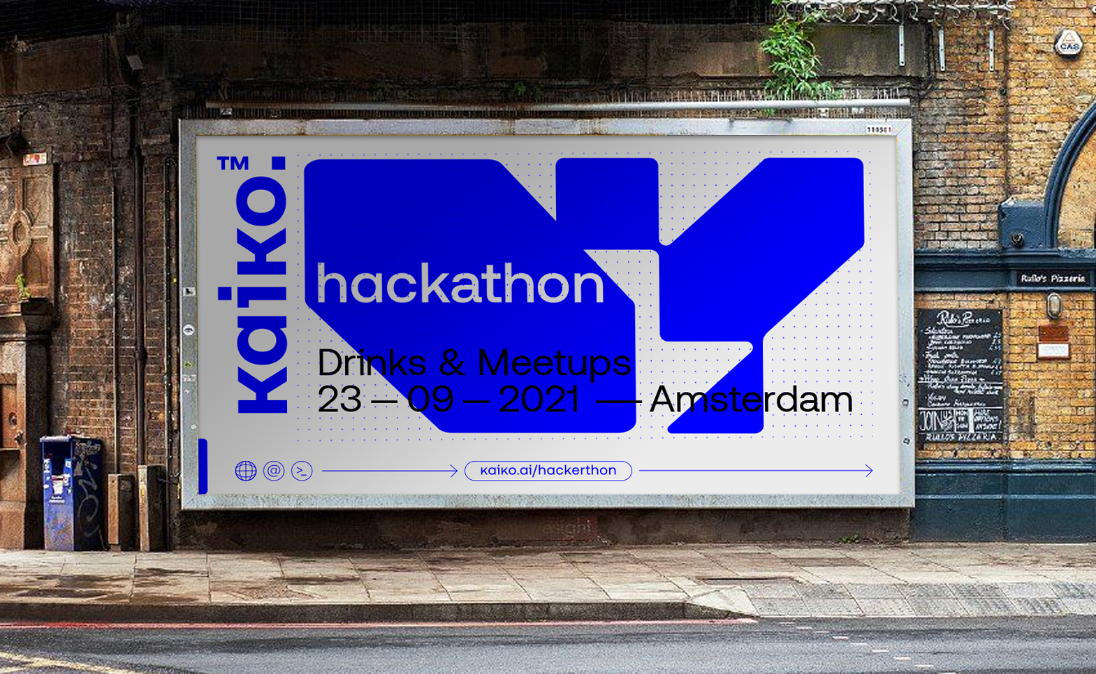
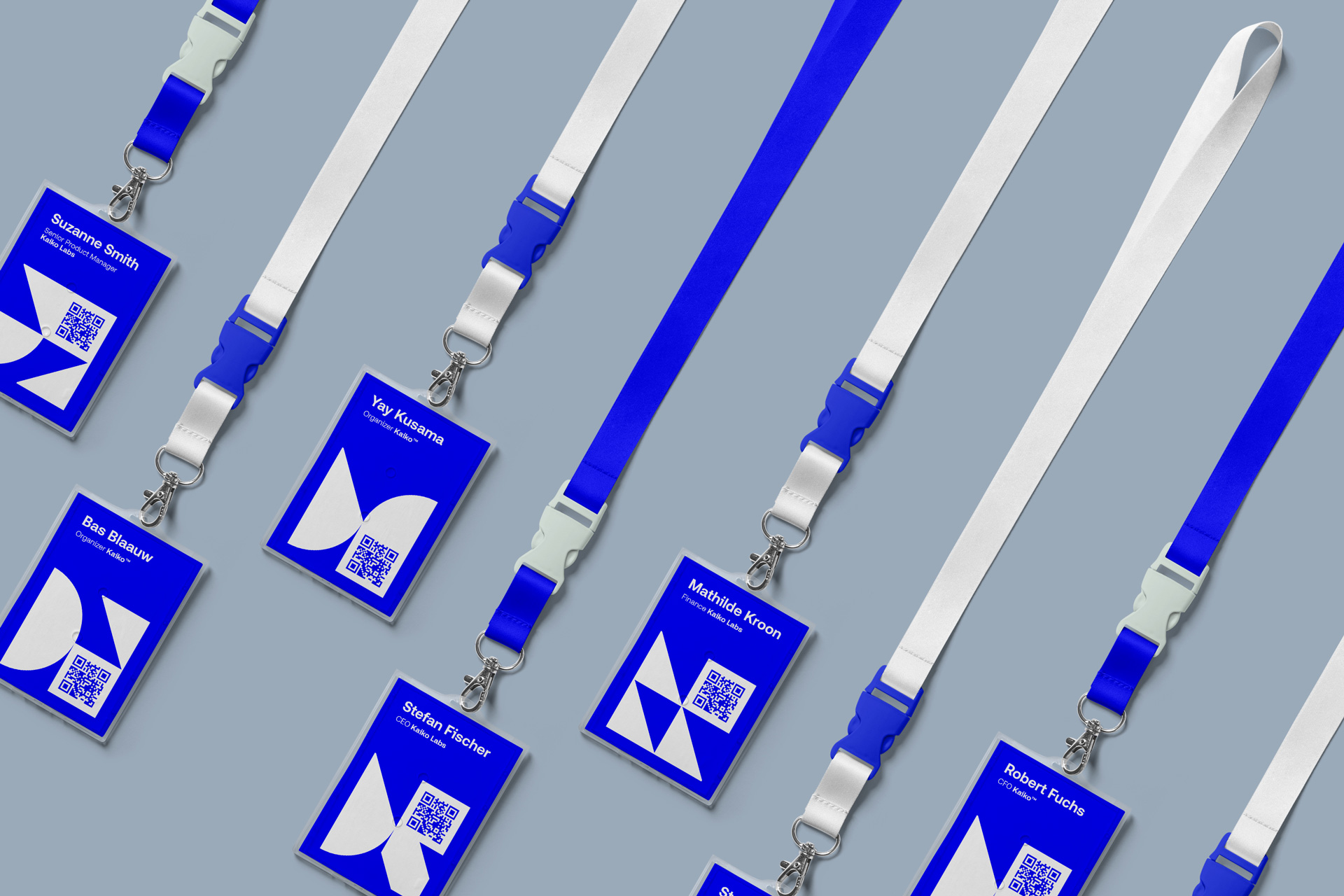
At the heart of Kaiko's brand identity is visualizing data. The intricate yet elegant design embodies the complexity of machine learning and A.I. while highlighting the simplicity and beauty of the insights and solutions it provides.
The color palette symbolizes the trust and reliability that Kaiko offers, while the bold and modern typography reflects the brand's innovative spirit.
We’ve developed a visual language that symbolizes data, but the system also shows that at Kaiko, we uncover what's hidden.


Design process
Kaiko is more than just a name. It's a symbol of hope and progress in the fight against cancer. With its groundbreaking technology, Kaiko is changing the game and leading the way toward a brighter future.
Designing the brand identity for Kaiko was a comprehensive and collaborative process during which we developed the brand's name, strategy, and identity design. The name 'Kaiko' is a derivative of the name given to the first vessel that reached the bottom of the Mariana Trench for research purposes. It means 'sunlight' or 'spotlight' in Japanese, which is exactly what this brand stands for.

